Color…less Design
There is something comforting and homely about the lack of color in a multicolored world. Bright, bold multicolored clashing colors are one very obvious way of attracting immediate attention, but 2021 could well be the year of the backlash.
In a fast, ultra-sensational, look-at-me world, a clever option is not to compete with bigger and brighter but to head off in the opposite direction. 2020 saw a move toward muted palettes and 2021 looks like taking that one step further.
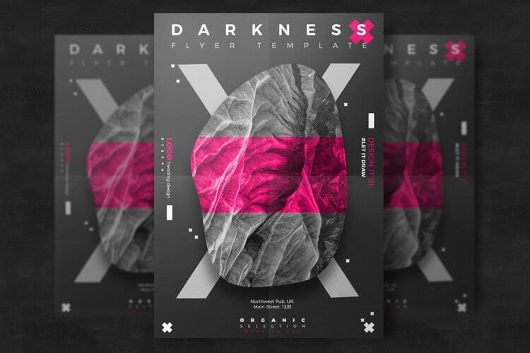
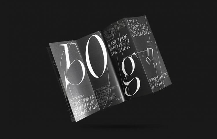
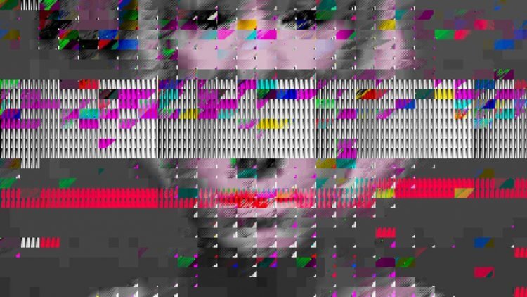
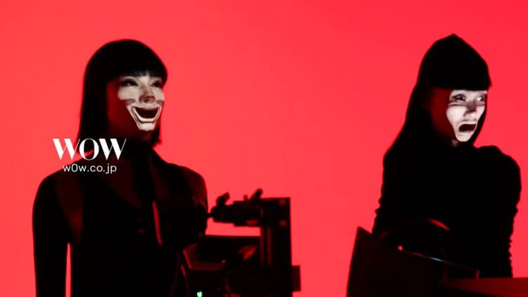
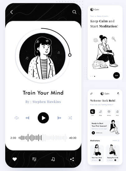
The classic black and white effect, soft, subtle, eerily enticing. You turn on the TV in the afternoon and stumble on an old black and white movie, we’ve all been there. How difficult is it to turn off or switch channels? There is a magical, almost hypnotic charm and a sense of nostalgia. Absolutely perfect for these crazy days.
This graphic design trend has the same effect. It’s not dull, it’s not boring, – a scheme designed to create an atmosphere and let the other effects; movement, shadows, animation, liquified organic shapes, content, stand out. Softer on the eyes strained by hours on the computer, it’s the permanent dark mode design
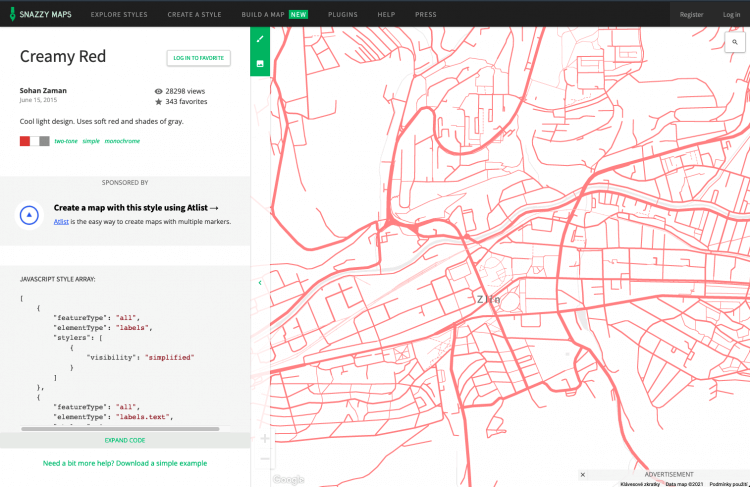
Don’t think we’re are talking only black and white with grayscale here, although this classic style does fit the bill. The fashion works brilliantly well with soft sepias, and minimal highlight colors too. Ultimately very cool and super effective. Enter into this world by checking through some of these fabulous designs.