Performant Design
With more ways to shop and less time to do it, consumers are impatient and increasingly demanding of the products they give their time to. Crafting highly performant digital experiences to meet these expectations means going beyond technical processes that speed up load times. It’s time for designers to own performance as a fundamental principle of good UX.
It’s time for Performant Design!
Performant Design:
- #1 is fast
- #2 feels fast
- #3 is simple
- #4 works everywhere
- #5 is for everyone
Digital innovation has had a big influence on the way we interact with the world today. Technology such as geo-location, social, and always-on connectivity has empowered digital services such as Uber, Doordash and Amazon Prime to stoke the on-demand economy. With just a few taps and swipes of their mobile device, today’s connected consumer can have a car outside their door, a meal from their favorite restaurant, and even their perfect match to share it with. We’re used to having what we want, when we want it, and we’re increasingly intolerant of digital applications that fail to deliver on this expectation.
“Users spend most of their time on other sites. This means that users prefer your site to work the same way as all the other sites they already know.”
Jakob’s Law of UX
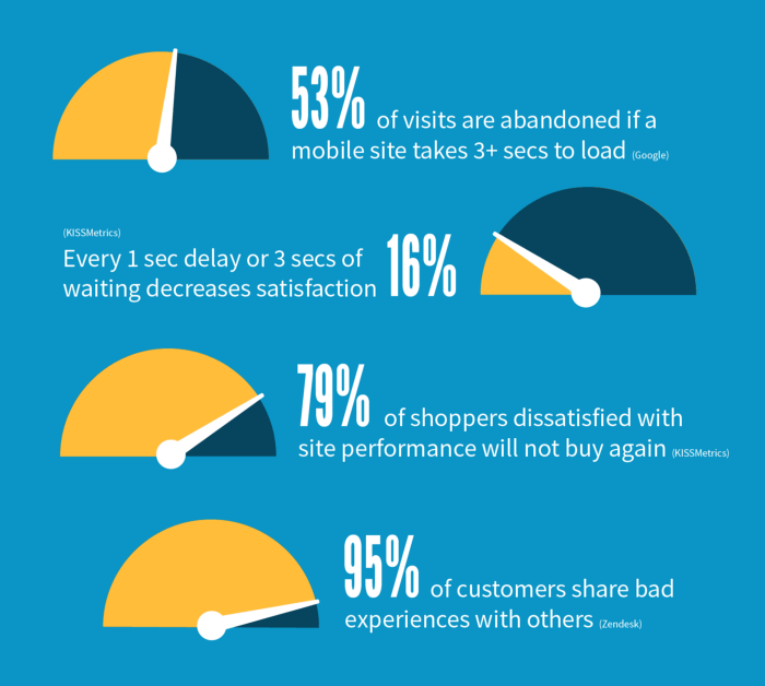
Your users won’t judge a new digital product or service against its nearest competitor, but against the applications they use most. This is driving a new expectation for high performance that, when missed, risks high levels of stress and dissatisfaction that can fatally impact a product’s success. Users will abandon a site that takes more than three seconds to load, become increasingly dissatisfied every second they have to wait, and not hesitate to publically voice frustration about a bad experience online.
“Design principles are the guiding light for any software application.”
Luke Wroblewski
Performant Design starts with five fundamental principles. These principles have been constructed to give designers a source of truth in communicating the concept to a wide variety of stakeholders and team members. They articulate the fundamental goals of designing for performance that all decisions can be measured against, keeping everyone moving towards a common goal.
#1: Performant design is fast
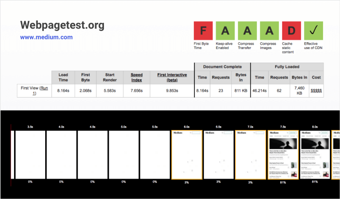
The length of time between a user’s interaction and the websitet’s response to that action will affect the user’s perception of the site. Performance testing tools such as webpagetest.org is useful to profile a full loading experience and test the site on various network speeds. A 300 and 1,000 milliseconds delay makes the user feel like a machine is working, but they begin to mentally context-switch when it takes more than 1,000 milliseconds.
These numbers matter when product scopes increasingly feature rich content such as dynamic elements, large JavaScript files and complex graphics, without consideration to the impact on performance. Often websites will unknowingly force their users to download unnecessary resources, but there are ways designers can lighten the load.
Simple things such as using system fonts and Variable Fonts rather than forcing the user to download heavy custom font files and their variations, has a big impact on page speed, and still gives designers control of the typographic hierarchy. Another way to speed up page speed is by Lazy Loading offscreen elements.This deconstructs the initial payload to render content that is in view first and loading images and other heavy elements later in the loading sequence, or as the user scrolls.

#2: Performant design feels fast
Looking again at the loading sequence we find that delays of less than 100 milliseconds feels instant, but a delay between 100 and 300 milliseconds is perceptible. When it comes to optimizing for speed, it’s all about what the user perceives rather that’s what’s actually going on under the hood.
Humans’ propensity for loathing unoccupied time is well illustrated in this real world example from Houston Airport. In an attempt to quell customer complaints about lengthy waits at the baggage claim, the airport execs chose to strategically move the arrival gates farther away from the baggage carousel. The time it took to unload the bags stayed the same, but giving the passengers further to walk eliminated time spent waiting around, and complaints stopped.
Designers using content skeletons can begin to display the page before content is fully loaded. This not only prevents disruptive “reflows” where content is pushed out to a different position on the page by subsequent items loading in its place, it also has the added benefit of making users believe the page is loading faster than it is through the use of visual progress indicators.

#3: Performant design is simple
Usability is about people and how they understand and use things, not about technology. Today’s user doesn’t read, they scan, and the more you make them think, the more likely they are to go elsewhere to get the job done. This makes clarity and simplicity key to creating a highly performant product.
“If something requires a large investment of time — or looks like
Steve Krug, author ‘Don’t Make Me Think’
it will — it’s less likely to be used.”
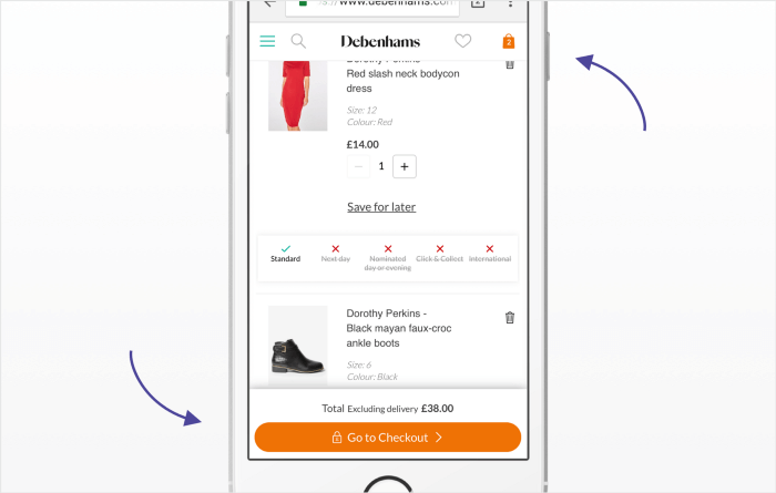
Through careful analysis and understanding of a user’s goals and requirements, designers are able to anticipate a user’s next action and present the interactive elements that allow them to move forward quickly. Pinning essential interactions to prominent positions on the page makes things obvious, reduces thinking time, and reduces the time it takes to complete tasks.
#4: Performant design works everywhere
Today’s user spends around 6 hours a day online with an average of 6.5 connected devices per person. Not only is it fundamentally important for digital products to work on a number of different devices, but also to function well in all areas of connectivity, including areas of no network connection at all.
Web browsers are taking advantage of technological innovations to deliver offline user experiences through the use of clear network status messaging and by reusing already downloaded content between pages. These tools let designers craft offline and low connection web-based user experiences without the frustration of getting slowed down or derailed completely.

#5: Performant design is for everyone
Incorporating accessibility principles into product design improves the overall usability for all that use it. Video captioning is one example of such, it not only benefits deaf users but also someone trying to learn a foreign language, users struggling to hear in a noisy environment, or conversely, users in a library where there’s enforced quiet.
Minimum font size and color contrast guidelines ensure maximum visual clarity when reading text, while guidelines on minimum tap targets ensure there is enough space between clickable elements. This improves usability while also reducing the number of errors (and time spent correcting them) caused by users accidentally tapping the wrong link.
Supporting key interactions through iconography not only helps users with challenges in cognitive ability, but also speeds up everyone’s ability to recognize common interactions, while labelling ambiguous icons eliminates the hesitation and time spent deciphering a symbol’s meaning.
“If it takes you more than 5 seconds to think of an appropriate icon
Nielson Norman Group
for something, it is unlikely that an icon can effectively
communicate that meaning.”

Conclusion
The decisions that are made during the design process can have a significant impact on a product’s success. Designers now have access to a large suite of tools and technology to help champion site speed, and with Performant Design, they can build on a set of principles that communicate the fundamental goals of a performance-driven digital experience.
By factoring performance into the design process, designers are not only helping users get things done quicker and with less frustration, they are demonstrating a heightened respect for their users’ time.


